Change Management - Being realistic about how well projects are delivered
Understand how well change is implemented in your organization
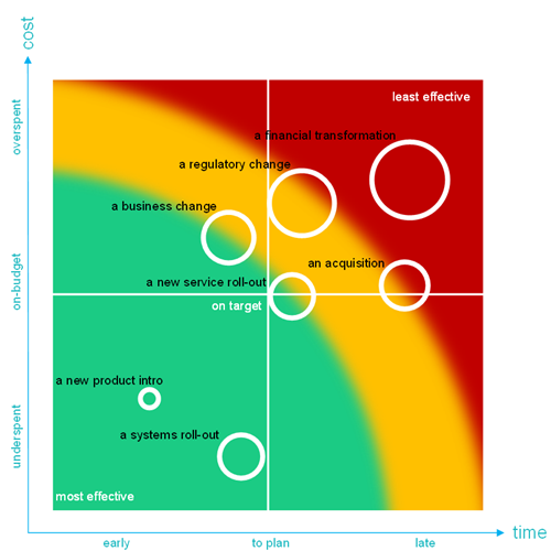
We can plot the effectiveness of projects on a graph. The graph to the side demonstrates the relative size of projects (the circles) and plots them against where they were in terms of cost and timing targets.
You can see that proposed, current and past changes can be measured against their budget and delivery timescale. The circles represent change initiatives and the size of the circles their relative size.
Project circles that are in the top right are the ones overspent and late. Circles in the in the centre are as planned. Circles in the bottom-right are the most effective because they were delivered within target.
Project will drift to the top-right corner when they are not properly planned, and the risks not accounted for. Equally, if they are gravitating bottom right, then you may be in an effective project-oriented organisation. This information will inform you of the size of the challenge you face and whether it will be relatively easy or difficult to affect your change.
To ensure projects do not drift to the top right we can ask ourselves the following question: What can we learn from past initiatives that helps us reduce the execution risk of future initiatives?